Free iPhone, Mobile, PDA, Style for vBulletin 4

Status
Not open for further replies.

Mr Happy

Active Member
4,093
2009
2,572
0
iPhone Mobile Style for vBulletin 4

This Mobile Style I made is the only iPhone style currently available at the moment for vBulletin 4. The theme is designed for the iPhone and iPod Touch but will work fine on all smartphones.


2w556k3.jpg
uu1ed.jpg


r7rwk8.jpg
1z2fte9.jpg


25gwh35.jpg
2s9avqf.jpg


[slide]http://i44.tinypic.com/1zwntcm.jpg[/slide]​

Features:
  • Custom Coded for mobile devices.
  • About 10% the size of the Default vBulletin skin.
  • All CSS layout for faster speed with only 6 images compared to about 200 in Default.
  • PopUp transparent menu.
  • Included dartho redirect mod to redirect mobile users to the mobile style.
  • Easy to modify CSS to modify it to the style of your site.

Code:
http://rapidshare.com/files/382704082/mobile-style.zip

Any problems bugs or suggestions please let me know.

Note:
As it's designed for the iPhone and mobile devices it won't display right in desktop browsers. It displays right in Chrome and Safari but won't display right in Fire Fox or Internet Explorer so for that reason I'm not giving a live demo and using Screen Shots instead as most of the noobs would say it doesn't display right.
 
28 comments
Would pay for some customizations/extra's

Hey Mr Happy, I love this style and would actually like to talk with you about expanding it to include also restyle the vB4 CMS and Blog and also to add better Android support.

I would love if you could contact me and we could talk about the sort of payment you would be looking at to make this happen?

Alternatively I would love to see what it is you have up your sleeves :D

Thank you

Ceri
 
Hi, thanks for sahring this. I have a question tho, what am I doing wrong uploading the style? I have vb 4.0.3 could be that the reason?
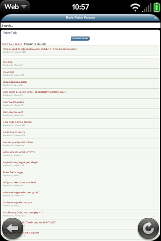
The problem is the iphone doesn't show the pages zoomed but like a normal page
picture2ah.png


Any advice? Thanks in advance.

hm, it stretches out really far so I still have to zoom in, is that normal?


I have the same issue with my browser.

webos 1.4.1

PAq8v.png


Any ideas?
 
GUYS! I found a fix for the stretched screen!

In ACP go to Style Manager > Mobile > Edit Templates > Header and add this to the very top:

PHP:
<meta name="viewport" content="width=320; initial-scale=1.0; maximum-scale=1.0; user-scalable=0;"/>

All fixed. ;)
 
Status
Not open for further replies.
Back
Top