

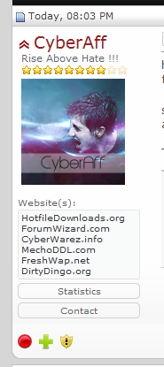
Since the IPB move is no more and we're stuck with this script for the forseable future we need to moderinize and make the site look more current. It's really starting to look old and dated. Their's a few places that could do with an hour of love and attention to make the place a lot more appealing. It's just attention to detail this place needs to make it look nice. I coded the below example in about 4 minutes. It's just a javascript element that hides crap. Let's get a few simple things like this done to make the site look better.
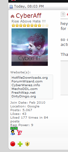
Another example. Why is there a top and bottom border to the sig area but not right or left? These little things annoy me.

Another thing. Half done rounded corners. It's like someone went to lunch half way through the job and forgot about the rest.

Another example. Why is there a top and bottom border to the sig area but not right or left? These little things annoy me.
Another thing. Half done rounded corners. It's like someone went to lunch half way through the job and forgot about the rest.
Last edited:


")