Guest viewing is limited
- You have a limited number of page views remaining
- 2 guest views remaining
- Register now to remove this limitation
- Already a member? Click here to login
You are using an out of date browser. It may not display this or other websites correctly.
You should upgrade or use an alternative browser.
You should upgrade or use an alternative browser.
WJ Skin - Stage 1 Design
- Thread starter DeLeTeD
- Start date


- Status
- Not open for further replies.
timtamboy63
Active Member
Flash mind PMing the PSD? I'll help out.
If not, just a few suggestions:
Make both the navbar & the header a bit smaller
Make the black gradients a bit more subtle
Vertically center the Welcome flash... bit and the time
If not, just a few suggestions:
Make both the navbar & the header a bit smaller
Make the black gradients a bit more subtle
Vertically center the Welcome flash... bit and the time
Lord Alexander
Active Member
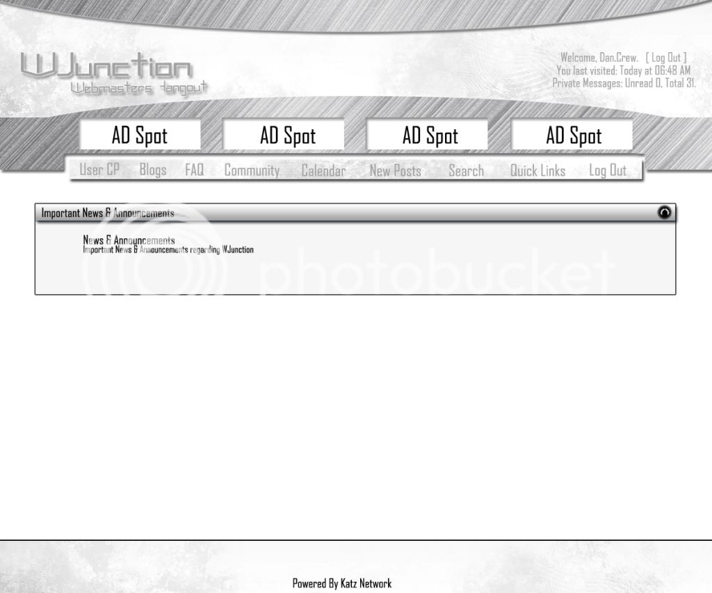
And some moar work, still haven't finished but you get the picture:
[slide]http://i31.tinypic.com/505gno.png[/slide]
I am 100000000% with Flash . i guess Flash will win this
")
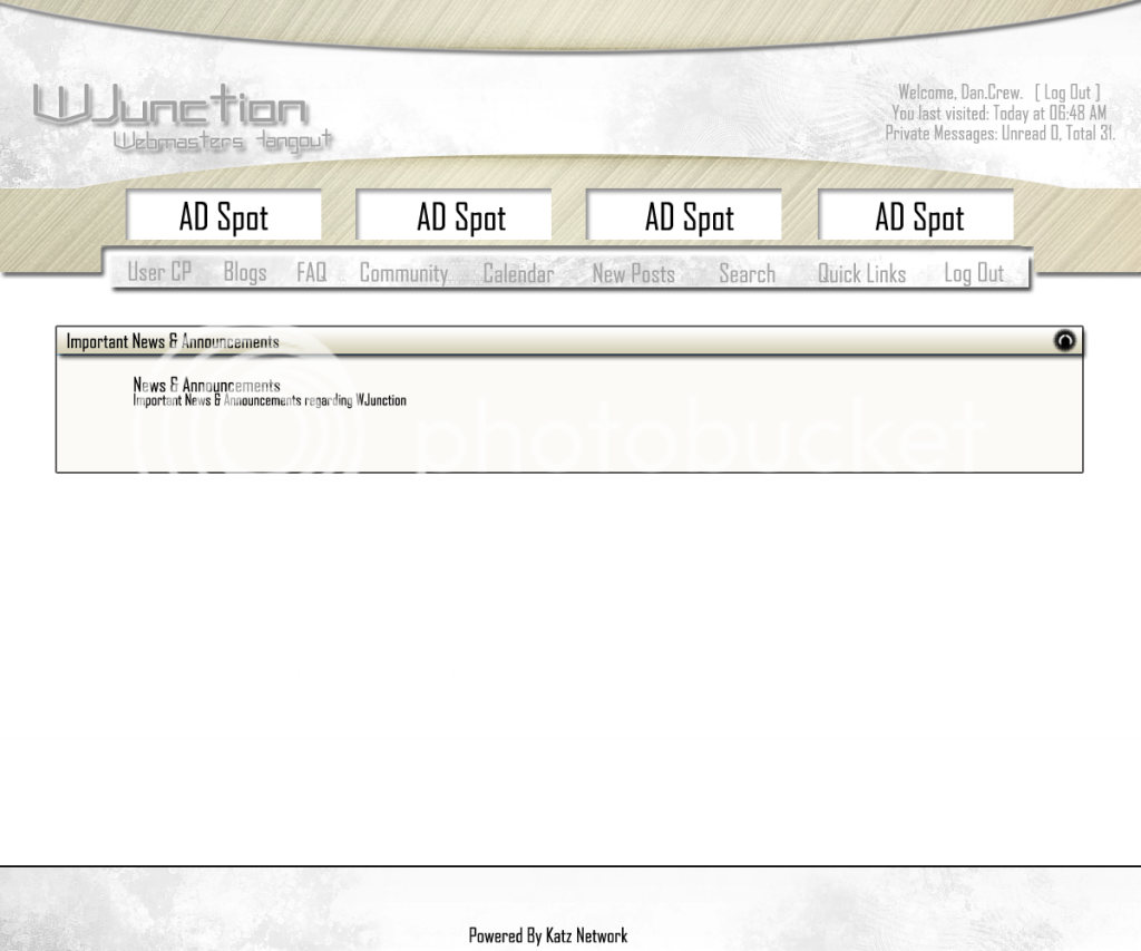
Nice work Flash. Not really sure about the time in the top left. Something is needed their to balance it out but I don't think a clock is the thing. I also don't follow what the large drop down arrows either side of the adverts are for. Rest looks good though.
Nice work Flash. Not really sure about the time in the top left. Something is needed their to balance it out but I don't think a clock is the thing. I also don't follow what the large drop down arrows either side of the adverts are for. Rest looks good though.
Yea I was wondering the same about those arrows on either side, not sure of the purpose or the reason. I also agree that the clock doesn't go very well, not sure what we can put there. Maybe a link to the last thread in the announcements section, or something. Not sure just a random dumb idea.
Looks pretty good dan crew, keep going and thanks for the effort.
Anyways thanks to those who have attempted and put work into a skin thus far. Keep it going so we can have a really good skin. :D
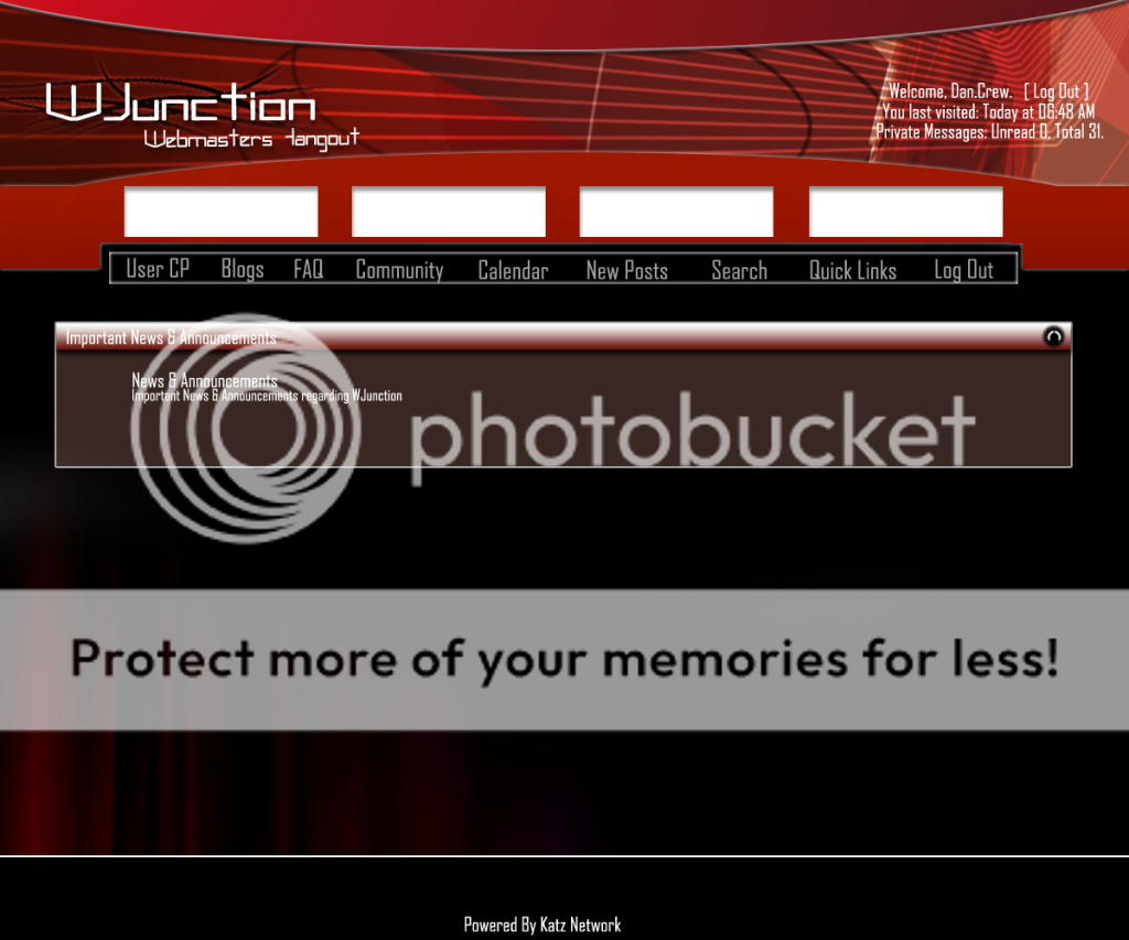

Here is my Entry, hope you guys like it, took me a whole morning to do!
[slide=500]http://i796.photobucket.com/albums/yy245/xpc247/wjunction.png[/slide]
Now comes in BLUE! :P
[slide=500]http://i796.photobucket.com/albums/yy245/xpc247/wjunctionblue.png[/slide]
Make the text smaller and the main body a little wide
Yea I was wondering the same about those arrows on either side, not sure of the purpose or the reason. I also agree that the clock doesn't go very well, not sure what we can put there. Maybe a link to the last thread in the announcements section, or something. Not sure just a random dumb idea.
Looks pretty good dan crew, keep going and thanks for the effort.
Anyways thanks to those who have attempted and put work into a skin thus far. Keep it going so we can have a really good skin. :D
We could probably make a decent wigit for their since we don't use a sidebar on WJ. I'm not saying it has to be a facebook or twitter one but something along those lines for updates or a feed. I know WJ doesn't use social bookmarks but these could be added here too possibly. I don't know just an idea and that's all before we've even seen all the other entries too.
the colors are too dark.hurting my eyes
If that's the only problem it can easily be fixed with a layer adjustment
The colours and everything can be toned down in an instant. You should really vote on the structure and icons
And of course if everyone thinks one part is ugly i'll change it
@warezdemon thanks for the tags :P looks better now
- Status
- Not open for further replies.