What's the deal with centered websites ?

Status
Not open for further replies.

JimmySeesASpaceship

New Member
4
2019
1
0
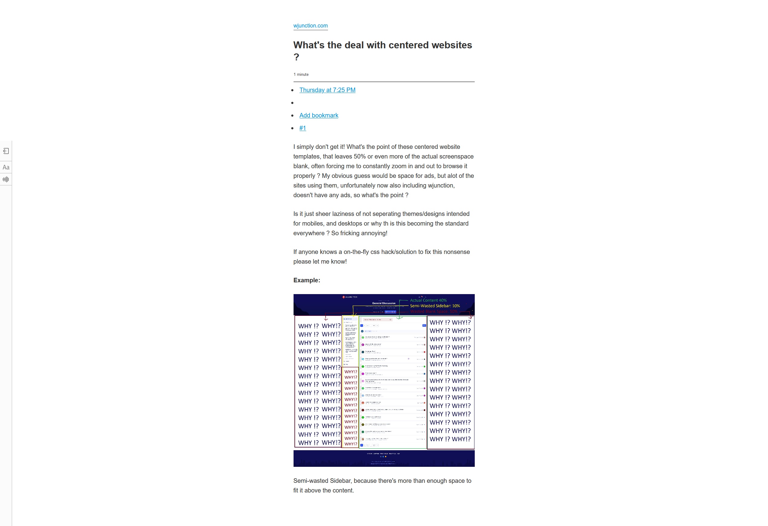
I simply don't get it! What's the point of these centered website templates, that leaves 50% or even more of the actual screenspace blank, often forcing me to constantly zoom in and out to browse it properly ? My obvious guess would be space for ads, but alot of the sites using them, unfortunately now also including wjunction, doesn't have any ads, so what's the point ?

Is it just sheer laziness of not seperating themes/designs intended for mobiles, and desktops or why th is this becoming the standard everywhere ? So fricking annoying!

If anyone knows a on-the-fly css hack/solution to fix this nonsense please let me know!

Example:

zwSIhKY.jpg


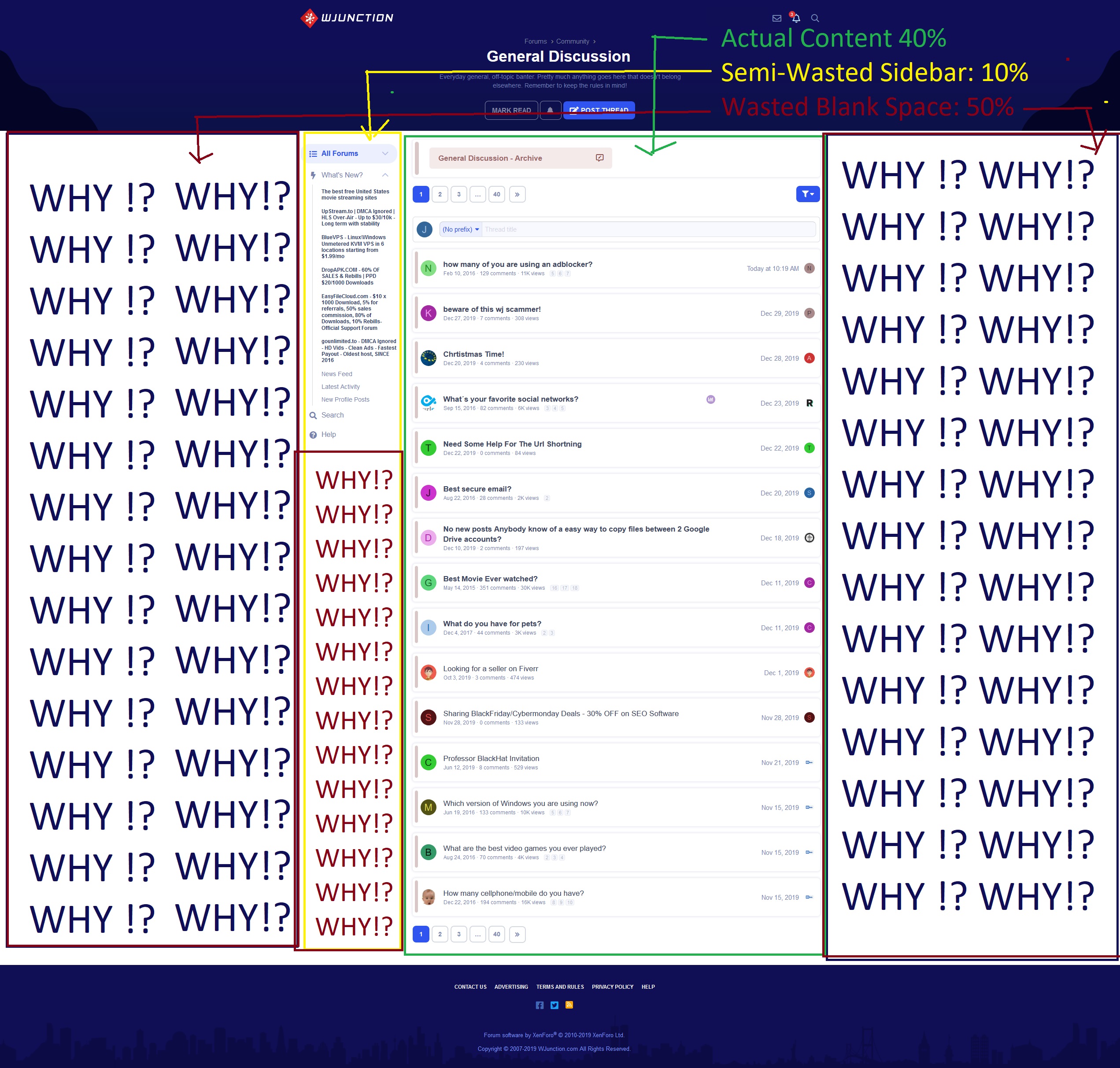
Semi-wasted Sidebar, because there's more than enough space to fit it above the content.
 
10 comments
You can use reading mode:)
Post automatically merged:

And there is almost no separate themes for desktops and mobiles, responsive design solves everything.
 
Hello,

Could you provide details on the device, browser and resolution?

Thanks

PC, Firefox (Same in Chrome), 2560x1440 (But it looks the same, when changing to 1920x1080).

You can use reading mode:)
And there is almost no separate themes for desktops and mobiles, responsive design solves everything.

Right.... here's Reading mode for you (it's even worse, and still squeezes everything into only using 30% of the screenview):
0WF8UCV.jpg

Post automatically merged:

1MWNew9.jpg


2 min edit time, sigh.... anyway, example of reader mode,
 
This is my display 2560x1080, everything is good, I usually have the browser set to 1/2 the screen.
Save image and view at 100% to see exactly how it displays on my screen.
Code:
https://i.imgur.com/iVmyZRn.png

It's the same thing on your screenshot, maybe people just got so used to centered websites, that they don't even recognize it anymore?

LTyqGbZ.jpg


It has been improved since my OP though, also on my end (except for reading mode), now actual content takes up about 60% instead of the 30-40% as shown in my original screenshot. I guess i'm just oldschool, from the time where websites would actually use 100% of your screenspace for content.

Also i do get the argument about it being easier to read in the center, but the point is, that before this trend become standard, sites used 100%, but also used larger fonts to support it, so the experience would be the same, just using your full screen space.
 
@JimmySeesASpaceship

When viewing at 2560x1080 I wouldn't expect any site to use the whole width. The theme is dynamic with a max width. Everything is perfectly viewable when you hit max width. If the forums width did get to 2560px it would be hard to read things spaced out that far, I don't see any problem?
I usually have 2 windows/browsers open each using 50% display width.
 
Perhaps anyone has 14" CRT display to sell? :)

As for me 27" (2560x1440) has a bit too small dot pitch, so I prefer using 2x24" displays instead.
 
Status
Not open for further replies.
Back
Top