
You are using an out of date browser. It may not display this or other websites correctly.
You should upgrade or use an alternative browser.
You should upgrade or use an alternative browser.
- WJunction Official News, Announcements & Feedback
- Feedback and Suggestions
- Feedback and Suggestions - Archive
So, what do you think of our new skin?
- Thread starter M
- Start date


- Status
- Not open for further replies.
AJ Blacklisted
Active Member
Here comes my suggestions
The header looks great. http://i.imgur.com/U9KGC.png
But some sort of mismatching with http://i.imgur.com/9hEAL.png
Loss of some 3d effects.
No need of this header part
Work on the css of this area

I dont like the subforum icons/thread icons


The button color is too dark (red one)
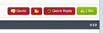
Some glossy gradient buttons will be cool.
And the Signature background

No need of the grey background color and stroke.
Reputation Point

Green was nice.
These all my personal suggestions. just letting you know
The header looks great. http://i.imgur.com/U9KGC.png
But some sort of mismatching with http://i.imgur.com/9hEAL.png
Loss of some 3d effects.
No need of this header part
Work on the css of this area
I dont like the subforum icons/thread icons
The button color is too dark (red one)
Some glossy gradient buttons will be cool.
And the Signature background
No need of the grey background color and stroke.
Reputation Point
Green was nice.
These all my personal suggestions. just letting you know
Just clicked. thanks for this option.
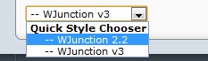
me too, New skin looks great but the old one has its own potential and thanks to wj team for putting skin options below to switch between them. Please don't remove the old one in future.
") )
)
The login bar doesnt have remember me enabled. So annoying to keep logging in.
Yup +1 i did tell and request it to have it inputted from you know where but i guess it was a miss
Im loving this skin! Awesome work.
Just one thing that maybe I could suggest to alter... The CB now looks a little messy. There should maybe be a space between the username and the comments. At the moment it looks too bunched up together. By making a visible separation in the two would make it easier to read and much tidier.
Just one thing that maybe I could suggest to alter... The CB now looks a little messy. There should maybe be a space between the username and the comments. At the moment it looks too bunched up together. By making a visible separation in the two would make it easier to read and much tidier.
Hm, some people didn't like the huge navigation 'tabs.'
Removed: http://i.imgur.com/ByQWi.png
Shrunk: http://i.imgur.com/gnyHQ.png
Maybe have it collapsible or something.
Just a thought.
Also, Websites in postbit aren't clickable anymore. (May be on purpose, not sure.)
Removed: http://i.imgur.com/ByQWi.png
Shrunk: http://i.imgur.com/gnyHQ.png
Maybe have it collapsible or something.
Just a thought.
Also, Websites in postbit aren't clickable anymore. (May be on purpose, not sure.)
Last edited:
Great stuff guys, Fix the chatbox, it doesn't look right though. Idk, it feel plain. no border, just a set of lines to seperate each msg without a left/right border around them looks weird.
#WJ2012!
Get the twitter function back!
And get that "My Statistics" bug fixed!
This shit is sexy.
cough cough mobile theme
#WJ2012!
Get the twitter function back!
And get that "My Statistics" bug fixed!
This shit is sexy.
cough cough mobile theme

When someone quotes your posts, it'll notify you. The modification hasn't been completed yet, it will be within 1-3 days.
oh, nice addon.
==================
Before logging in
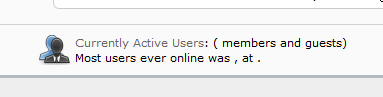
The number is missing.
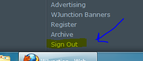
Signout link is shown to guest.

Online now isn't visible to guest.
googleplus
Active Member
skin is awesome!! and perfect but i think it take abit more time to load then older version.. So need more optimization..
- Status
- Not open for further replies.