The name of your website is pretty blur. That is not good for readability. I think you should make things clear for the readers. Also if you adjust top navigational links in two lines only, they will look much better.
Change logo.
Too many categories in the title/header, instead put the categories in a sidebar, it will look more organized that way.
Add more products
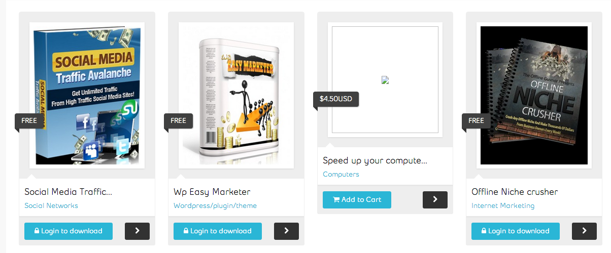
Your products look bit disorganized (and images are not loading either):
This site uses cookies to help personalise content, tailor your experience and to keep you logged in if you register.
By continuing to use this site, you are consenting to our use of cookies.