I find it well organized.
Regarding the layout, the body seems a bit empty with those huge empty zones on the sides. Maybe you should try to align the tables to the left and create a sidebar on the right. It would be a nice place to put the football leagues and a section for ads.
You can improve the logo.
You have to fix the horizontal navigation menu, it fits, but looks sloppy. The paddings around the text aren't symetrical on all the buttons - specially the 'Home' button.
Can you make the leagues on the header clickable? It's the most intuitive move.
And these are my suggestions, good luck, niksa88







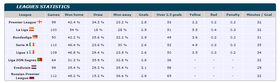
 it looks good.