Guest viewing is limited
- You have a limited number of page views remaining
- 6 guest views remaining
- Register now to remove this limitation
- Already a member? Click here to login
You are using an out of date browser. It may not display this or other websites correctly.
You should upgrade or use an alternative browser.
You should upgrade or use an alternative browser.
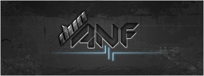
Logo For My Music Group - $100 Reward
- Thread starter Florios
- Start date


- Status
- Not open for further replies.
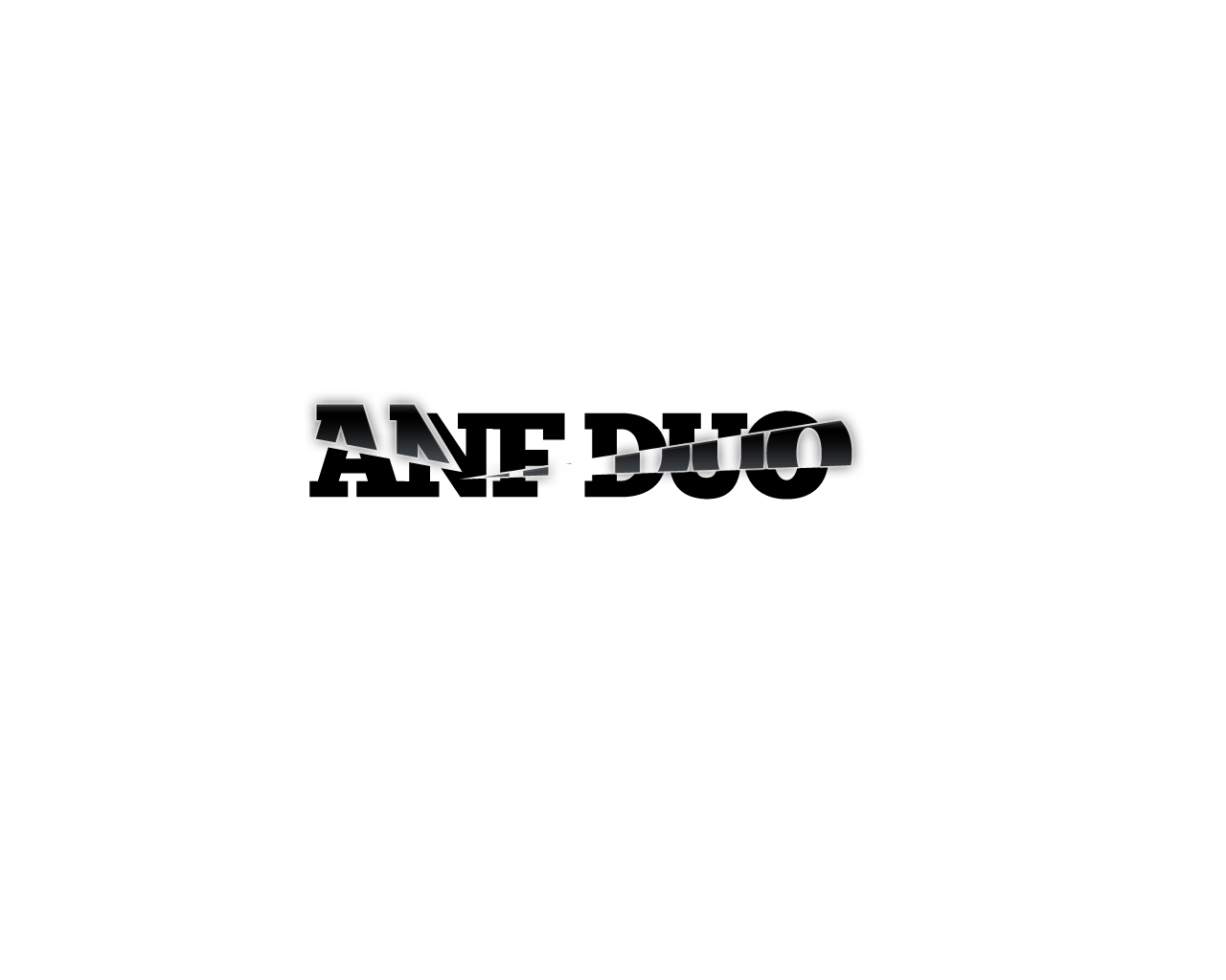
Me likey! Great ones m8! Really impressive and Pro! (y)Here is my editions


Hope you like it...
sniffdog, maybe you missed this part.
")
these are sick thats what im talking about, keep em comin though. i wont beable to pick till this friday minimum when my partner gets back those are nice though.
This thread is a week old with many contributions. Time to announce a winner and pay the $100 reward.
^^ yup ive announced that i cant untill atleast friday cause my partner is comming back from the domnican.
---------- Post added at 11:12 AM ---------- Previous post was at 11:02 AM ----------
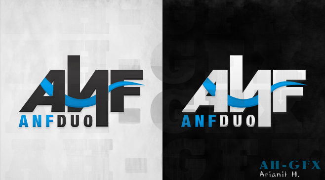
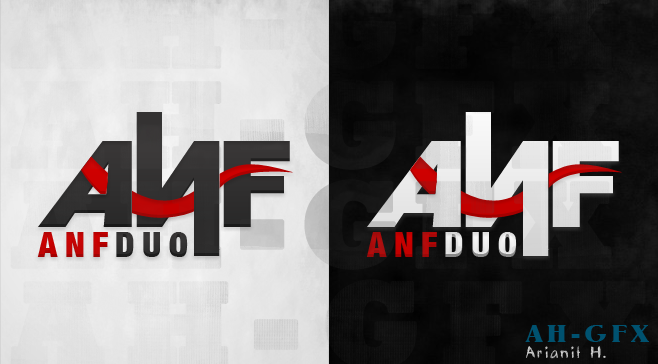
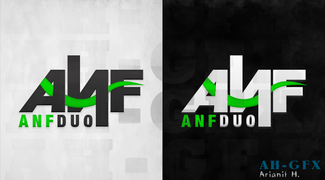
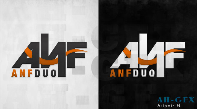
Tried some Cleaner Texts With the style :D and Tried another Style
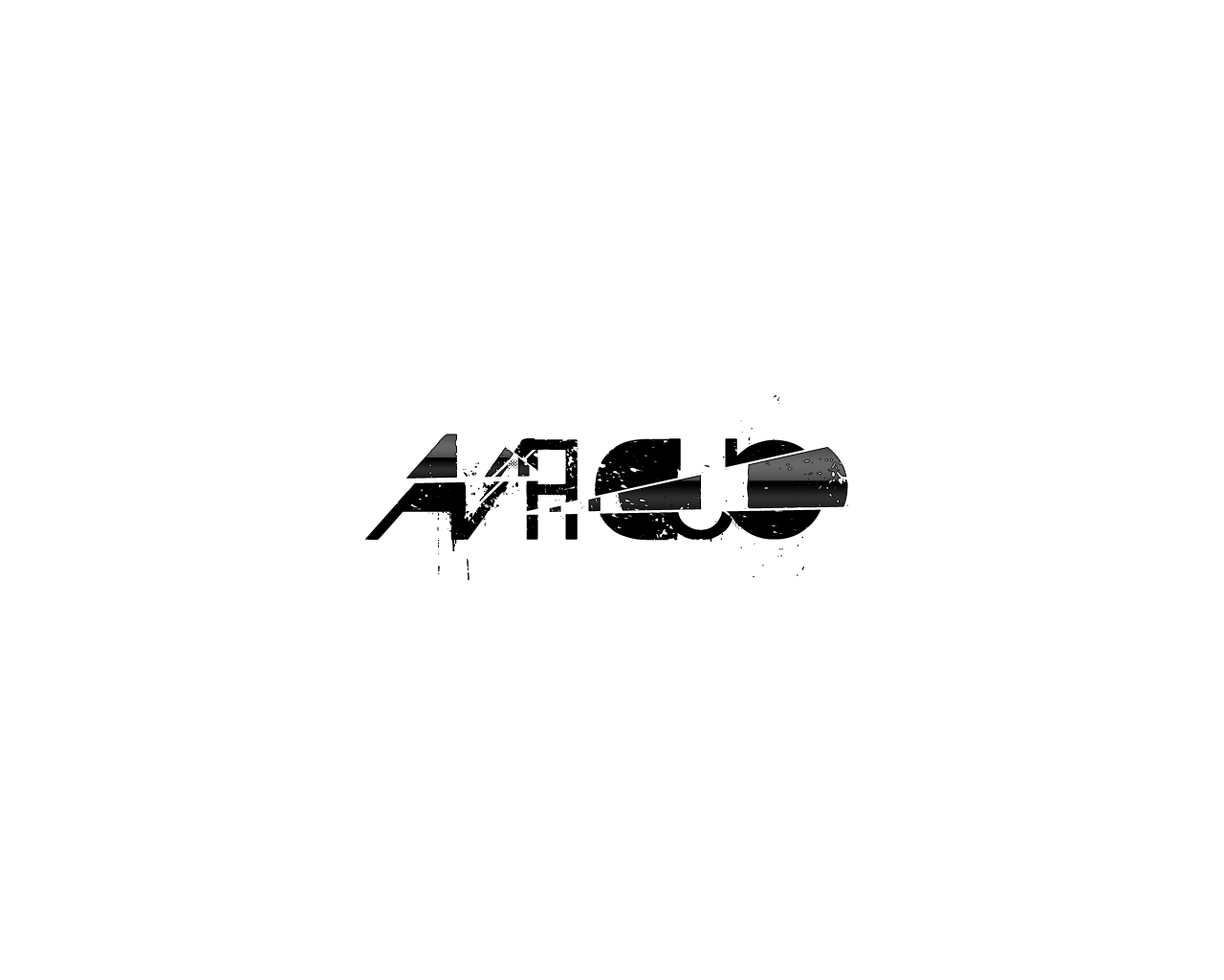
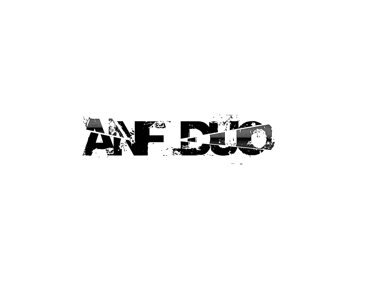

Any Changes Can Be done :D
Will try more
What do u think ?
their nice but by clean i mean a straight nice wide font with no little kinda things stickking out.
---------- Post added at 11:14 AM ---------- Previous post was at 11:12 AM ----------
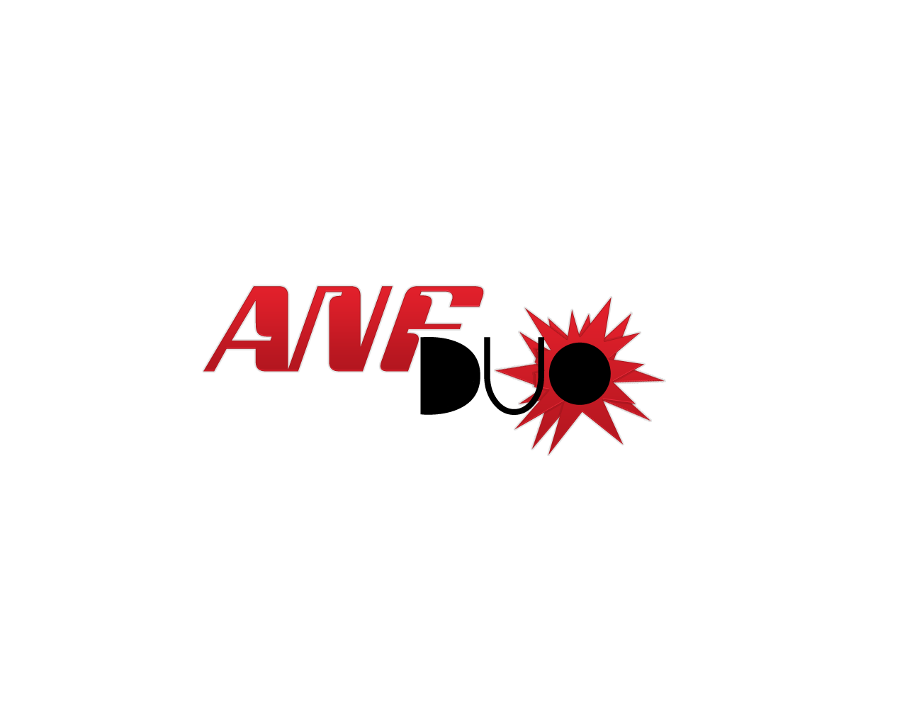
MY ENTRY:

any change required can be done........
plz tell........if you also need the full name bellow the logo....
will try more......
REGARDS
Gibblet
thx for the try, these ones dont feel right for me though
---------- Post added at 11:15 AM ---------- Previous post was at 11:14 AM ----------
Here is my editions
Hope you like it...
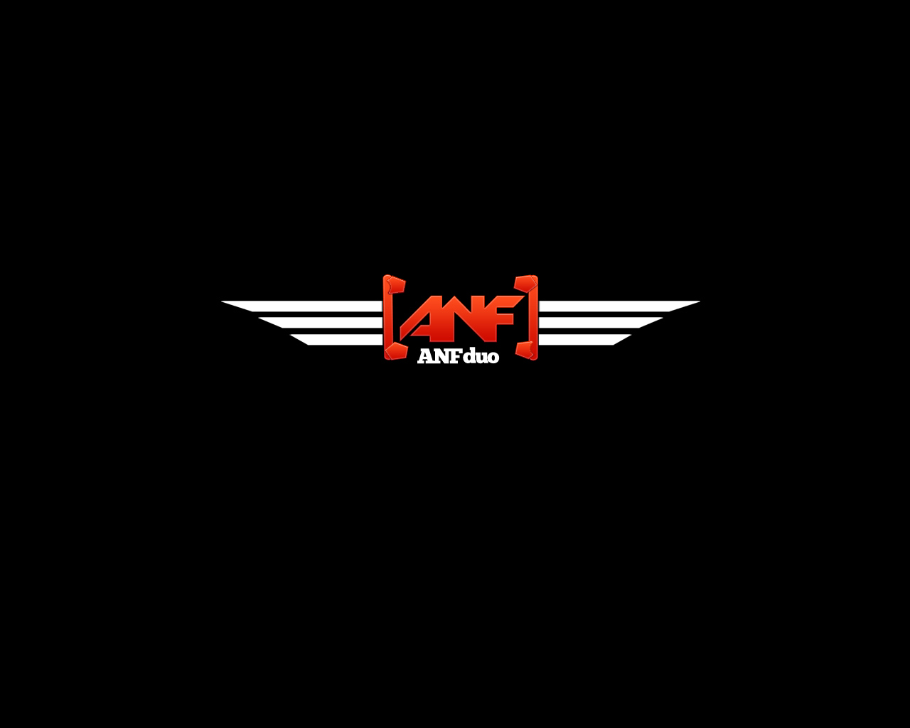
these look great (y)
its just too many effects going on, it needs do be more of a 1 color deal.
---------- Post added at 11:17 AM ---------- Previous post was at 11:15 AM ----------
first page updated!
best ones yet, looking professional, clean & sleak yummy :P
Gonfreecs99
Active Member
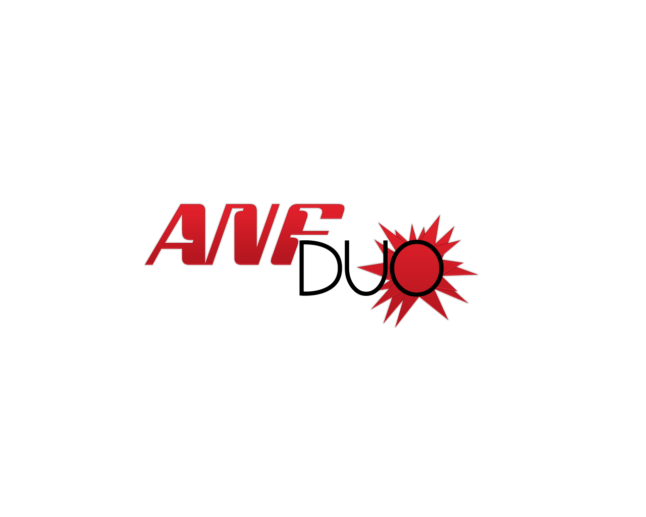
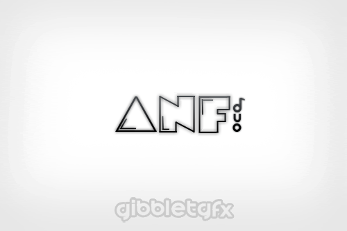
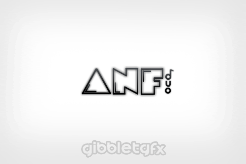
Much cleaner Font
What do u think ?
Enjoy :D
Last edited:
i like the top one now, the bottom i feel like you were just trying to do wings cause everyone else was lol.
---------- Post added at 02:11 PM ---------- Previous post was at 02:09 PM ----------
original was better nice and clean.
---------- Post added at 02:11 PM ---------- Previous post was at 02:11 PM ----------
sorry man theres just so many designs, id be here all day if i was to comment on all of them.
Edit: yours was the one with the fingers, i did comment on it.
---------- Post added at 02:11 PM ---------- Previous post was at 02:09 PM ----------
I added a bit of grunge effect to the wings.
[SLIDE]http://i42.tinypic.com/10da4aq.png[/SLIDE]
This is still 100% vector and any feedback will be appreciated.
original was better nice and clean.
---------- Post added at 02:11 PM ---------- Previous post was at 02:11 PM ----------
You don't have to like my work, but at least you could comment on it...
Now you don't have to.
sorry man theres just so many designs, id be here all day if i was to comment on all of them.
Edit: yours was the one with the fingers, i did comment on it.
lol thats cool but were not a band so that one wont work, for the others who have posted those are looking pretty web 2.0 style, keep in mind these arent for websites thx
Gonfreecs99
Active Member
Florios:Honestly Yeah lol
i will try more simple unique
do u have any Specific color ?
i will try more simple unique
do u have any Specific color ?
no im not looking for a specific color, but i am looking to keep it simple aka not very much effects [no weblogo type things (gloss, shine, bevel, textures)] for color i mean anything is fine but id prefer white and black, but dont let that stop you, if you are going to add color try to keep it to the basics (red blue green brown) i dont like yellow so dont do that.
Gonfreecs99
Active Member
Ok I will try my best :D
I will try my best :DGonfreecs99
Active Member
Ok :D
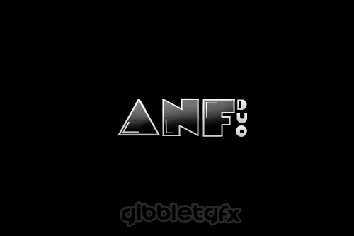
i Tried the simplest logo ever


The last one , the text of it Was Pentooled
Enjoy
i Tried the simplest logo ever
The last one , the text of it Was Pentooled
Enjoy
Gonfreecs99
Active Member
Lol
Edited it

Edited it
to the above post, ive set this right here earlier today
so actually it will be 8th.
actualy im on pacific time so depending on where you live it could be the 9th.
so actually it will be 8th.
first page updated!
3 DAYS LEFT
If your are planning to submit please get them in before then
there will be a 1 day buffer for desition making.
so that means entry cut off will be in 3 days, and then desition will be made on the 4th.
actualy im on pacific time so depending on where you live it could be the 9th.
A small comment will be highly appreciating..,

Any changes can be done.
---------- Post added at 01:04 PM ---------- Previous post was at 12:56 PM ----------
I just want to mention that u have already sold almost the same logo for lulzmp3.
Link: http://www.wjunction.com/1190922-post40.htm
Any changes can be done.
---------- Post added at 01:04 PM ---------- Previous post was at 12:56 PM ----------
Hey faizann20, Do you think re-using almost the same logo is a good idea?[SLIDE]http://i.imgur.com/oOjKU.jpg[/SLIDE]
[SLIDE]http://i.imgur.com/dB0VB.jpg[/SLIDE]
---------- Post added at 09:03 AM ---------- Previous post was at 08:46 AM ----------
[SLIDE]http://i.imgur.com/nH852.jpg[/SLIDE]
One more :D
I just want to mention that u have already sold almost the same logo for lulzmp3.
Link: http://www.wjunction.com/1190922-post40.htm
- Status
- Not open for further replies.