It looks like you're overusing the overrated purple and orange gradient map. This ain't 08', stop using that shit, or at least get creative with it. The first one is too messy but the second one has a great flow but its way too fucking bright on the bottom left.
7/10, they're both too over exposed + sharpened. The second one has great flow though.





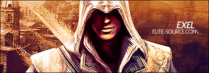

 Awesome. <3
