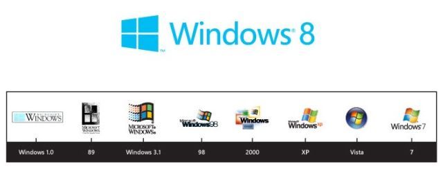
New Windows 8 logo confirmed by Microsoft
By John Callaham
By John Callaham
Earlier in February, Internet leaks showed that Microsoft was creating a new Windows logo for the launch of Windows 8. At the time of the reports, Microsoft didn't confirm or deny any plans to change the logo and some writers even said it was a hoax. Today, Microsoft revealed that the reports were true and that it was indeed redesigning the logo for Windows 8.

In a post on the Blogging Windows web site, Sam Moreau, the Principal Director of User Experience for Windows, said that the company had a number of goals in mind when creating the Windows 8 logo. One was using a font similar to the International Typographic Style that was an influenc on Metro's design. He states:
Moreau added that Microsoft wanted the new logo to look like something created with digital materials rather than real world materials like glass or wood, saying, "It has motion aligning with the fast and fluid style youll find throughout Windows 8." He added:Using bold flat colors and clean lines and shapes, the new logo has the characteristics of way-finding design systems seen in airports and subways.
The third party design company Pentagram assisted Microsoft in the creation of the new Windows 8 logo. Among other things, Pentagram helped to create a new design for Time magazine and designed the logo for the Guitar Hero game franchise. Moreau writes that in a meeting to discuss the new logo, one of Pentagram's designers, Paula Scher, asked the question, "Your name is Windows. Why are you a flag?"Our final goal was for the new logo to be humble, yet confident. Welcoming you in with a slight tilt in perspective and when you change your color, the logo changes to reflect you. It is a Personal Computer after all.

Indeed, as the blog shows, most of the previous versions of the Windows logo look more like a flag than a window, thanks to the logo looking like it is moving and flapping in the wind like a flag. However the very early versions of the Windows logo looked much more like a true window. Moreau writes:
The new Windows 8 logo is certainly a big departure compared to the Windows 3.1 days which all of the other Windows logos have emulated. While it still looks a bit like a stiff flag, it definitely has more of a true window design."Windows" really is a beautiful metaphor for computing and with the new logo we wanted to celebrate the idea of a window, in perspective. Microsoft and Windows are all about putting technology in people's hands to empower them to find their own perspectives. And that is what the new logo was meant to be. We did less of a re-design and more to return it to its original meaning and bringing Windows back to its roots reimagining the Windows logo as just that a window.


