This is indeed a great design !
Awesome, if it is your first one.
Also, is this going to be your personal blog?
")
Looks great to me.
Some suggestions from my side:
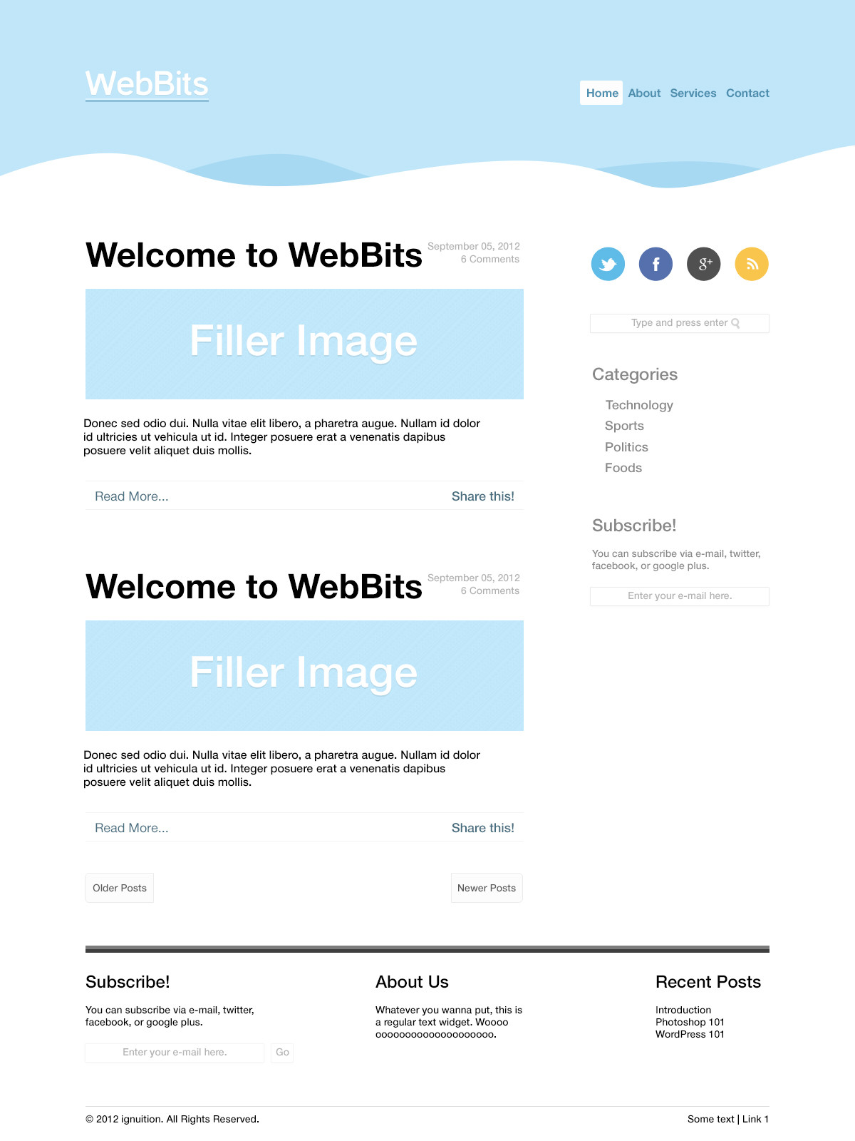
1. You could probably remove the categories from here
http://i.imgur.com/TF13J.png, looks crowded.
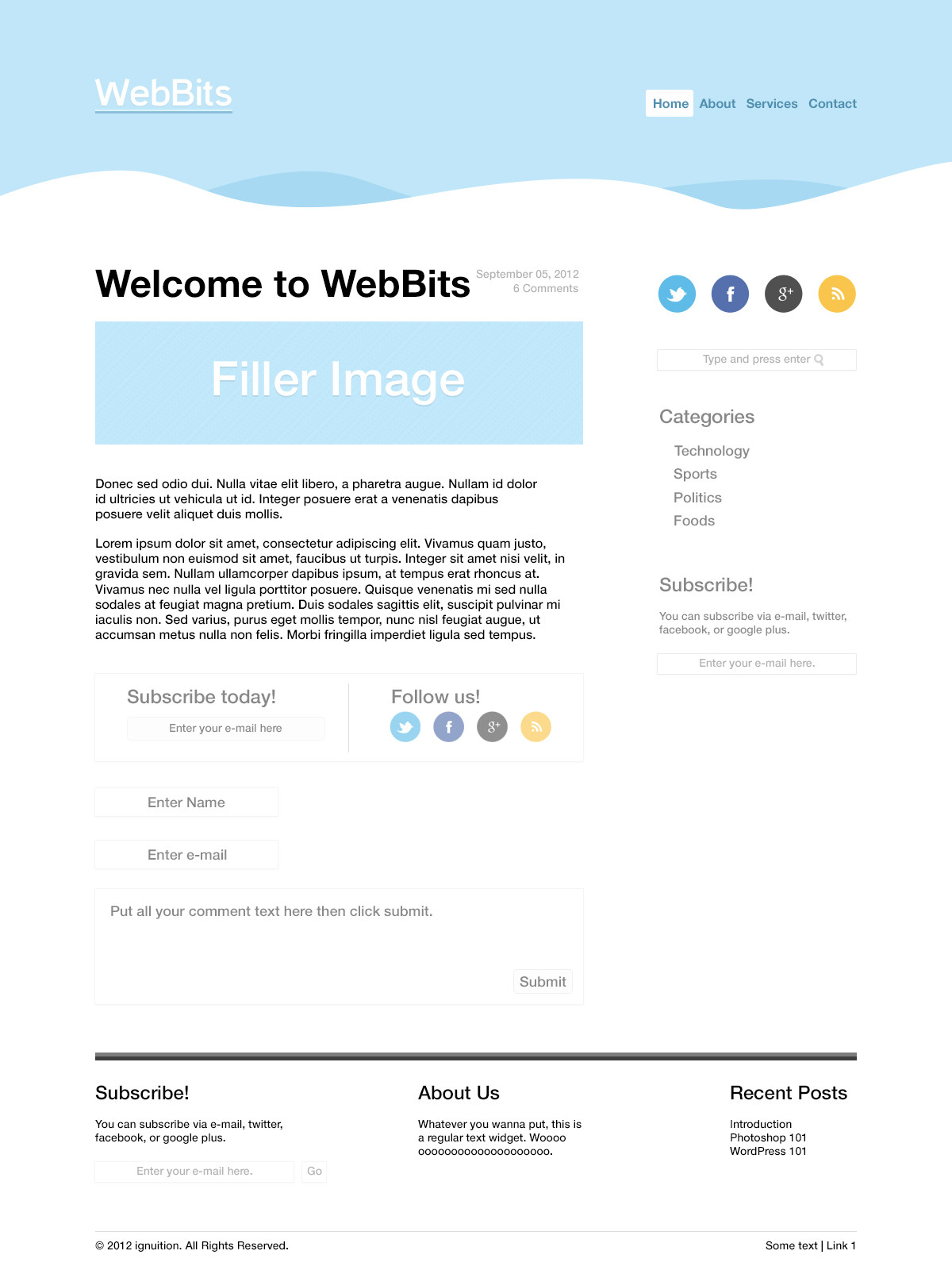
2. You could have a border/bg for the postbit., to differentiate from the main bg. (Its my opinion though)
3. Probably differentiate these sidebar widgets?
http://i.imgur.com/dW4qK.png A little spacing will do
4. The sidebar titles are of varied sizes and positions, usually they are of same size and aligned along the same line.
http://i.imgur.com/p7ToN.png - you can leave it as it is, but again, just a suggestion to make it look great (y)
5. Perhaps a different color for the "read more" link will look a lot better.
And overall, i like your design. Minimal and neat.
Gratz (y)
Regards,
Froomple