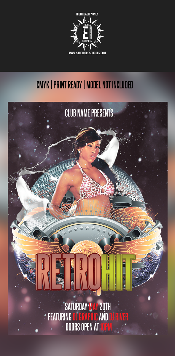
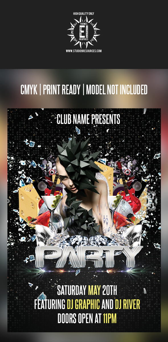
The font for the first one if horrible, you pretty much killed the design with that font. Second one fits the flyer better but could use some work. Use more then 1 font for flyers it makes it look more creative. Flyer name: Party. Wat. Think of something more creative. I know that the people who buy it can change the name when they receive the psd but it makes your presentation look bland. If you are planning to post this on graphicriver I suggest you tidy up the font, people are picky and keep in mind when you use a font that doesn't go well with the flyer you pretty much killed the design.
This site uses cookies to help personalise content, tailor your experience and to keep you logged in if you register.
By continuing to use this site, you are consenting to our use of cookies.


") we'll see how things go
we'll see how things go