The h3 font looks too bulky for me, it made the site really unattractive at first glance. I don't like the font at all but if you want to use it, don't have it bold for h3.
Your site promotes the fact that you are new/inactive by advertising the categories on the left sidebar. Remove it and use blogroll to categorize your shit instead. Looks neater and much more user friendly.
A site should only ever have 2 headers the need for two is very rare unless it's like the one on WJ where it floats while you scroll. Move all that live tv/prem accounts/free internet trick stuff on the side of your site if you want people to check it out.
You have 2 search boxes, lol.
It might be just ad block plus but I get this,
I'd remove your email off your site and use your FB/Twitter/Google Plus as a way of contact instead. You can always have a contact form as well, having an email can make you susceptible of getting spammed.
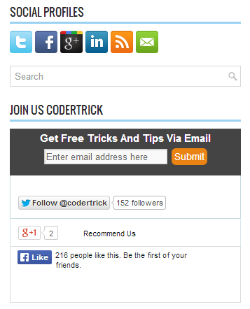
You promote your social media in a redundant way,
Either have the icons or have the follow/like/+1 buttons.